The real impact of data analytics and visualization comes when they are applied as they were designed to be.
In the world of indirect tax, data is both an essential resource and a constant challenge. Tax teams are tasked with complex reconciliations, identifying anomalies, ensuring compliance, and producing reports that are suitable for both regulatory authorities and senior management. It is in this environment that many professionals believe they can rely on tools such as PowerBI or Tableau, under the impression that these platforms can perform every task required for data-driven tax compliance.
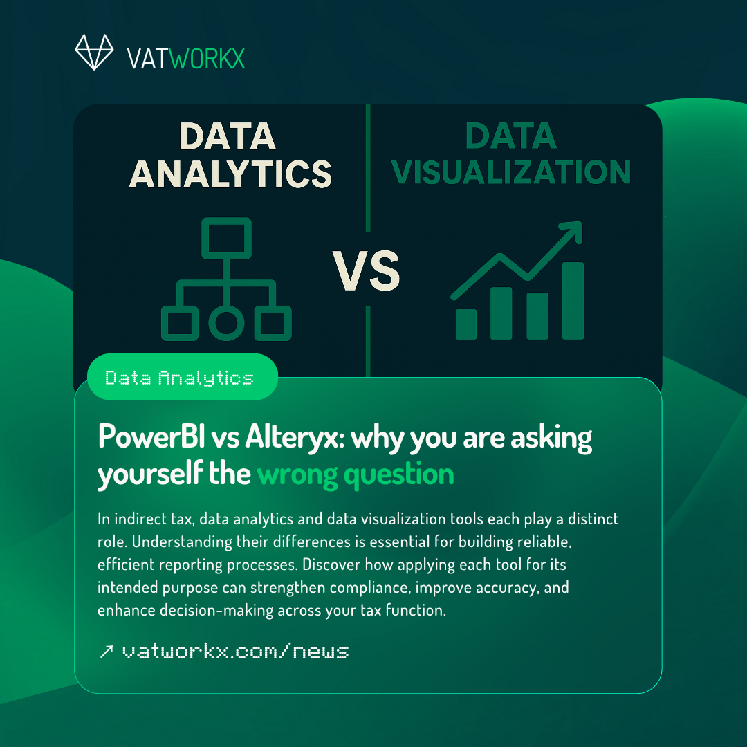
This is a misconception, and it can lead to inefficiencies, reduced accuracy, and missed opportunities for automation. The reality is that data analytics tools and data visualization tools serve distinct purposes, and understanding how different their purposes are is essential for creating a robust tax technology strategy.
What data analytics tools do
Data analytics platforms, such as Alteryx or KNIME, are primarily designed to prepare and transform data. Their core function is to take raw, messy, and disparate datasets and convert them into clean, structured, and analysis-ready outputs in a very consistent way. This involves blending data from multiple sources, applying complex business rules, performing reconciliations, and enriching data with additional context such as currency conversions or tax jurisdiction mappings. These tools are built to automate repetitive processes, handle large volumes of data without performance issues, and provide full audit trails to ensure that the transformation logic can be reviewed and validated. Basically, they act as the kitchen where tax data is prepared and refined into a reliable foundation for further analysis.
What data visualization tools do
By contrast, data visualization platforms such as PowerBI or Tableau are designed to present already-prepared data in a way that facilitates interpretation and decision-making. They excel at creating interactive dashboards, applying filters and drill-downs, and delivering information in a visually engaging manner that supports quick insights. It is important to note that these tools are not primarily intended to perform heavy-duty data cleaning or transformation. Rather, they operate most effectively when provided with accurate, structured datasets that are already compliant with the business rules required for VAT reporting or other indirect tax obligations. In this sense, they are only the waiter bringing you your order, not the chef in the kitchen; their role is to communicate the results of data processing, not to perform that processing in the first place.
Using the right tool for the job
When an analytics tool such as Alteryx or KNIME is introduced into those process, the transformation logic is centralised, repeatable, and fully auditable. The output from the analytics tool becomes a “golden dataset” that can be seamlessly fed into PowerBI or Tableau for reporting. The visualization tool then focuses solely on delivering insights, knowing that the underlying data is already correct and complete.
Clean, complete, and logic-applied data is the foundation of reliable reporting. Data analytics tools provide the engine room where this foundation is built, while data visualization tools provide the platform for communicating the insights drawn from it. Treating these tools as interchangeable undermines the strengths of both and can lead to compromised compliance processes.
Choosing the right tool for the right stage of the process ensures that indirect tax teams spend less time dealing with preventable data issues and more time providing strategic, insight-driven value to the business.
If you have a question on this topic or if you would like to have a chat on how data tools can provide you with more peace of mind, feel free to schedule a coffee chat with us using this link – or get in touch with us using the chat button in the bottom-right corner.